Client Overview: Andina Brewing Company was a 16 month old brewery who had lost their direction and identity in their short time in operation. The owners are Colombian and the brewery reflected that heritage with a South American tropical aesthetic and food menu. Although the atmosphere and location were working well, management was having a hard time connecting with the local customers in terms of both brand and beer offerings
Scope: For this craft brewery in East Vancouver Canada, I was brought onboard to revitalize the brand in it’s entirety. The first mandate for the rebrand was entirely outside my normal design and branding roles. I was tasked with updating the beer offerings and recipes. For this I used the same approach I do for all other rebranding. I took the disparate and unaligned elements together to form a more cohesive and appealing line-up.
After
Before
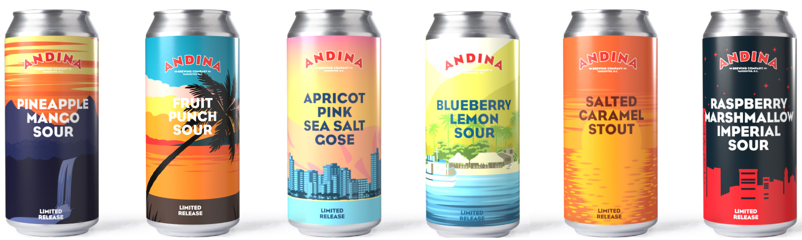
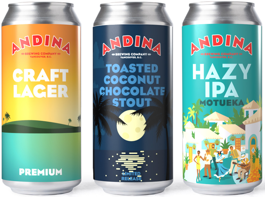
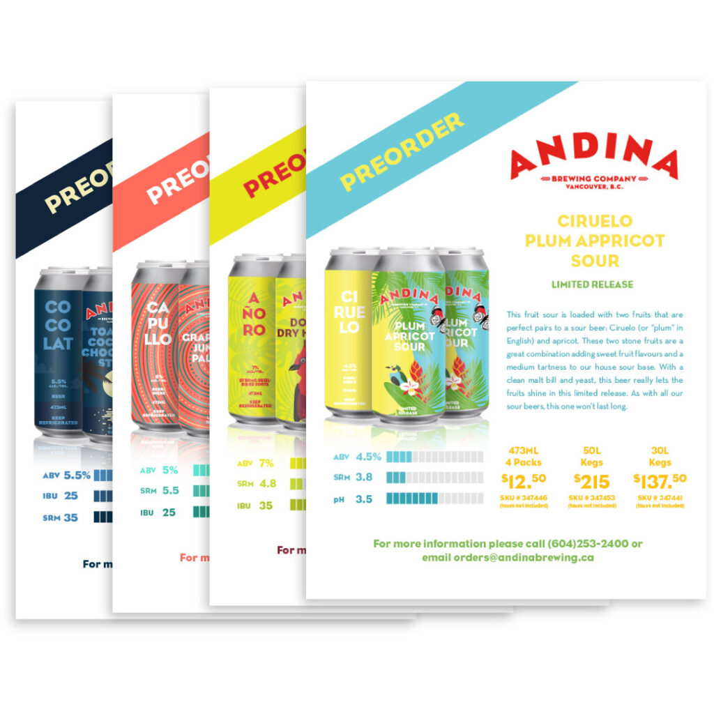
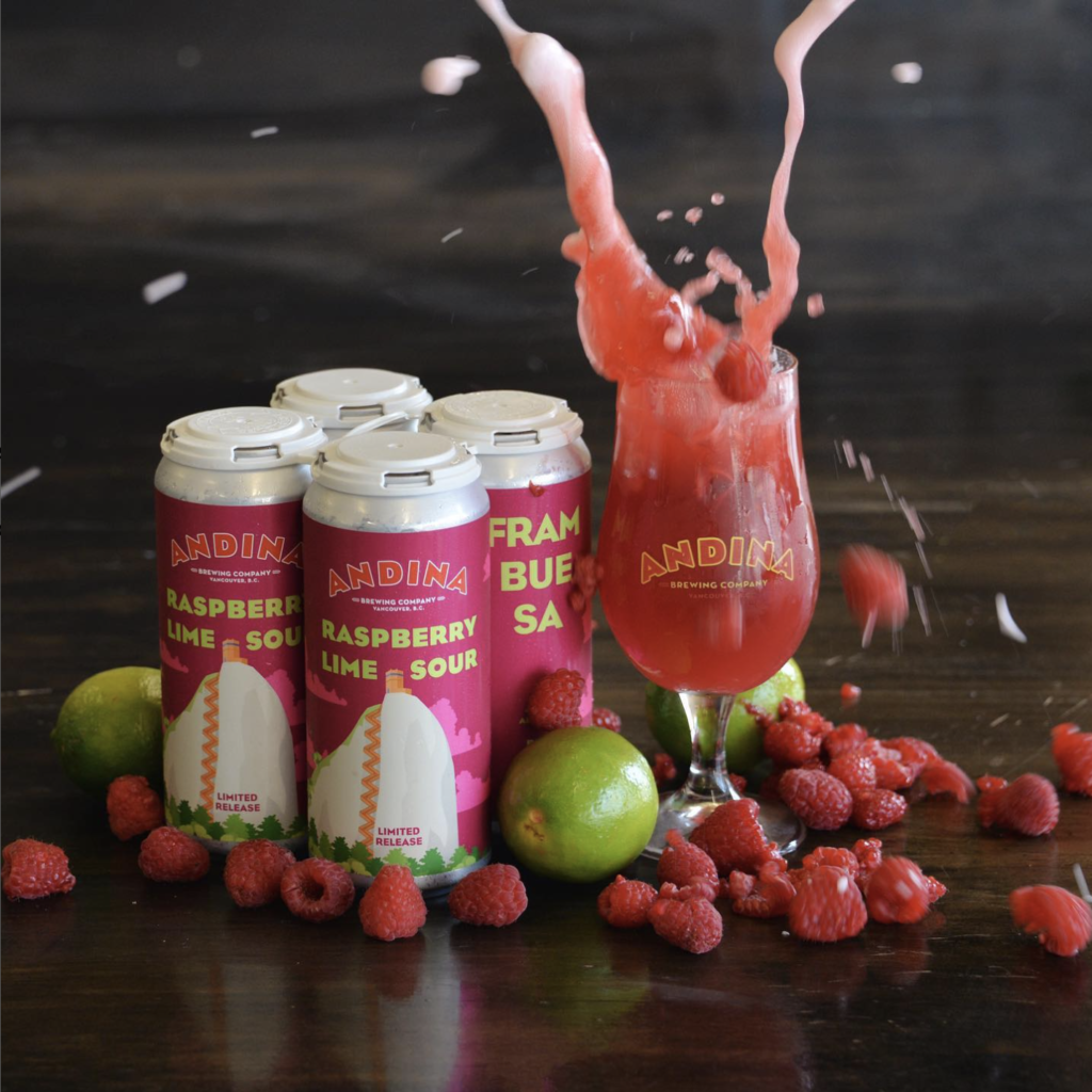
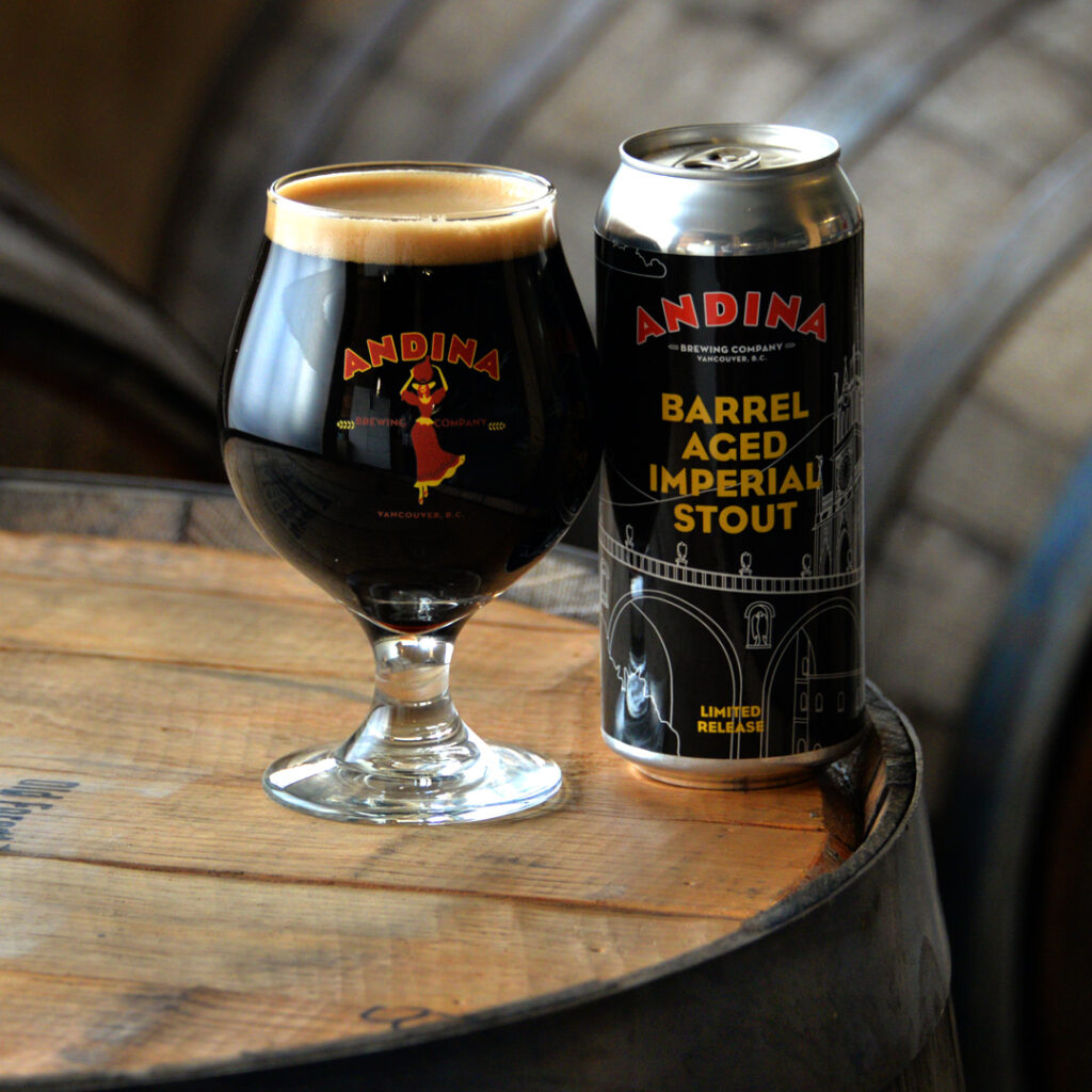
Packaging Redesign: The next major challenge was reimagining the brewery’s visual presence. I first started by redesigning their can line-up. The old labels, as seen above, were nearly identical to each other. In fact, upon interviewing the staff, I found that several of them even had a hard time distinguishing them apart. Not only was the design and color the same, the names were all obscure three syllable Spanish words and the style of beer was hard to find on the can. Using a customer experience mindset, I placed the style of the beer front and center. I also changed the artwork so each beer it’s own unique design while still embodying the tropical Colombian heritage. I went one step farther and featured one unique and amazing location in Colombia to act as an educational piece about the amazing and rich country that is largely unknown by the local craft beer customer.
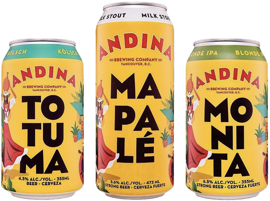
Where Brand and Sales Meet: During the development of the brand’s new IPA, the team realized that external sales were easier for a core IPA that didn’t change while rotating, unique IPA releases sold best internally and generated more media attention.
The solution we developed was a core IPA, named Brumosa, that was a mainstay but featured a different hop in each iteration. This blend of the two concepts balanced both needs and helped with sales on all fronts.
From a design perspective, I used the brands label layout and incorporated the brand’s imagery of a man playing guitar on the famous streets of Medellin. For each iteration, I revised the hop name, changed the version number on the back, and added one more person to the street scene. Each one is based on a famous Colombian.
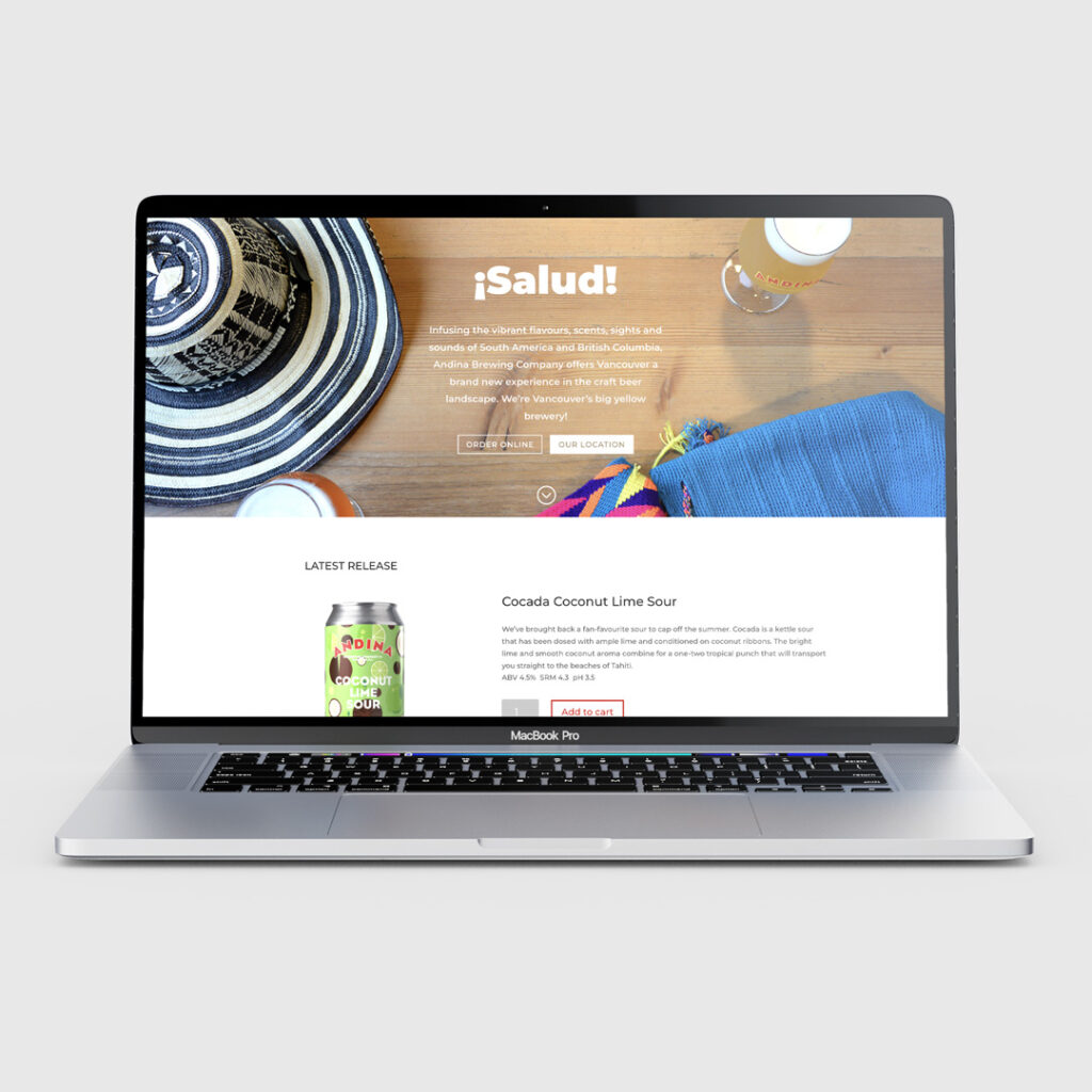
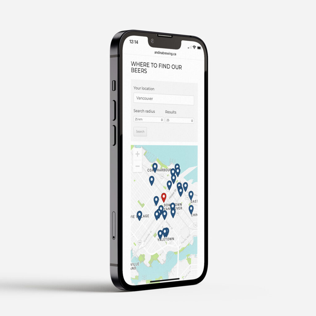
Website: After completing the packaging and marketing redesigns, the website was the next piece to be updated. To bring the website to where it needed to be for the customers’ experience as well as the staff’s ease of use, the new website was created on WordPress with focus on new products, a store locator and an integrated online store. Attention to the mobile experience was a high priority as we found many customers, particularly new ones, used the map feature to find the brewery and stores on the store locator.
Results: In the end, this brand revival consisted of new label designs, social media presence, marketing material, website, and merchandise. Within four years, Andina Brewing saw a sales increase of over 300% as well as a 200% increase of social media followers. The company’s distribution area expanded to three provinces and merchandise sales skyrocketed.